发现自己的css的动画
animation有点不是很过关,这份笔记就详细记录css的animation的知识和一些实际的应用,帮助我自己好好巩固知识(其实起因是因为我看了一篇关于animation的博客然后有点看不懂animation的语法)
css中实现动画有两种方式:transition过渡动画、 animation自定义动画
# @keyframes
keyframes(关键帧),在css样式表中可以通过@keyframes来设置关键帧动画,并指定动画名称供使用者使用
其语法如下:
我们可以通过百分比来设置具体帧数的样式。
@keyframes animateName {
    0% { width:50px; height: 50px; }
    50% { width:100px; height:50px; }
    100% { width:50px; height:50px; }
}
0%和100%代表首尾帧,也可分别使用from、to替代。下面代码与上述代码效果相同
@keyframes animateName {
    from { width:50px; height:50px; }
    50%  { width:100px; height:100px; }
    to	 { width:50px; height:50px; }
}
需要注意的是: 若自定义动画未定义首尾帧,则首尾帧将会应用使用者的原有样式
现在动画定义完毕,使用者需要配置animation相关属性对动画进行配置。
# animation-name
若某个元素想要使用对应名称的动画,需要配置animation-name: animateName属性进行锁定
一个例子:
<style>
    .box{
        width: 50px;
        heigh: 50px;
        background-color: pink;
        animation-name: test;
        animation-duration: 1s;
        animatio-iteration-count: infinite;
    }

    @keyframes test {
        50% {
            width: 100px;
            height: 100px;
            border-radius: 50%;
            backgroud-color: skyblue;
        }
    }
</style>

<body>
  <div class="box"></div>
</body>
这里为了让动画更加明显,使用了animation-duration与animation-iteration-count,这里简单介绍一下:
animation-duration用于定义动画持续时间,默认0sanimation-iteration-count用于定义动画迭代次数,也就是执行次数,默认为1
# animation-duration
animation-duration顾名思义,用于设置动画持续时间.
需要注意的是:默认值为0s,也就是说,若不配置animation-duration则默认请况下是没有动画效果的,即便使用animation-name锁定了动画名称,由于动画持续时间为0s,所以没有效果。
# animation-timing-function:
animation-timing-function用于定义时间函数,通过这个选项,可配置动画随时间的运动速率和轨迹。
| 值 | 描述 |
|---|---|
| linear | 动画从头到尾的速度是相同的。 |
| ease(缓解) | 默认值:动画以低速开始,然后加快,在结束前变慢。 |
| ease-in | 动画以低速开始。 |
| ease-out | 动画以低速结束。 |
| ease-in-out | 动画以低速开始和结束。 |
| cubic-bezier(n,n,n,n) | 贝塞尔曲线(自定义数值),可到相关网站 (opens new window)可视化设置。 |
<style>
  * {
    margin: 0px;
    padding: 0px;
    box-sizing: border-box;
  }
  body {
    width: 100vw;
    height: 100vh;
    display: flex;
    flex-direction: column;
    align-items: center;
    background-color: #34495e;
  }
  ul {
    display: flex;
    flex-direction: row;
    justify-content: center;
    list-style: none;
    display: flex;
  }
  ul > li {
    width: 40%;
    margin: 0px 40px;
    position: relative;
  }
  ul > li > .fa {
    font-size: 4em;
    color: white;
    opacity: 0.8;
    animation: test 2s infinite;
  }
  @keyframes test {
    to {
      transform: translateY(86vh);
    }
  }
  ul > li:nth-of-type(1) > .fa {
    animation-timing-function: linear;
  }
  ul > li:nth-of-type(2) > .fa {
    animation-timing-function: ease;
  }
  ul > li:nth-of-type(3) > .fa {
    animation-timing-function: ease-in;
  }
  ul > li:nth-of-type(4) > .fa {
    animation-timing-function: ease-out;
  }
  ul > li:nth-of-type(5) > .fa {
    animation-timing-function: ease-in-out;
  }
  ul > li:nth-of-type(6) > .fa {
    animation-timing-function: cubic-bezier(0.29, 1.69, 0.39, -0.05);
  }
  li > span {
    position: absolute;
    color: #f1c40f;
  }
  strong {
    color: #e67e22;
    margin: 10px;
  }
</style>
<body>
  <strong>animatin-timing-function:</strong>
  <ul>
    <li>
      <span>linear<br />线性</span>
      <div class="fa">👇</div>
    </li>
    <li>
      <span>ease<br />默认。动画以低速开始,然后加快,在结束前变慢。</span>
      <div class="fa">👇</div>
    </li>
    <li>
      <span>ease-in<br />以低速开始</span>
      <div class="fa">👇</div>
    </li>
    <li>
      <span>ease-out<br />以低速结束</span>
      <div class="fa">👇</div>
    </li>
    <li>
      <span>ease-in-out<br />以低速开始和结束</span>
      <div class="fa">👇</div>
    </li>
    <li>
      <span>cubic-bezier()<br />贝塞尔曲线(自定义数值)</span>
      <div class="fa">👇</div>
    </li>
  </ul>
</body>
# animation-delay
animation-delay用于设置动画延迟时间,单位为s
下例动画将于2s后执行
当同时使用多个动画时,这个属性使用频率非常高,可依次定义每个动画的延迟执行时间,区分开每个动画。
# animation-iteration-count:
animation-iteration-count用于设置动画执行的次数,默认值为1只执行一次。
其值可分为两种:
- 具体number数值
infinite:执行无限次
# animation-direction
animation-direction用于设置动画执行方向,具体来说可设置为以下值:
| 值 | 描述 |
|---|---|
| normal | 默认值。动画按正常播放。 |
| reverse | 动画反向播放。 |
| alternate(交替的) | 动画正向交替执行(正向->反向)Loop。 |
| alternate-reverse | 动画反向交替执行(反向->正向)Loop。 |
| inherit | 从父元素继承该属性。 |
# animation-fill-mode
animation-fill-mode用于设置动画的填充模式,主要应用的属性值为:
| 值 | 描述 |
|---|---|
| none | 默认值。动画在动画执行前后,不会应用任何样式到目标元素。 |
| forwards | 在动画结束后(由 animation-iteration-count 决定),目标元素将保持应用最后帧动画。 |
| backwards | 在动画结束后(由 animation-iteration-count 决定),目标元素将保持应用起始帧动画。 |
下例代码,在动画执行结束后,将会一直应用最后帧的样式。
.box {
  width: 50px;
  height: 50px;
  background-color: pink;
  animation-name: test;
  animation-delay: 2s;
  animation-duration: 1s;
  animation-fill-mode: forwards;
  /* animation-iteration-count: infinite; */
}
@keyframes test {
  100% {
    width: 100px;
    height: 100px;
    border-radius: 50%;
    background-color: skyblue;
  }
}
# animation-play-state
可设置动画的执行状态,通常通过JavaScript动态控制。
- 默认值为:
running - 设为
paused(暂停),动画将停止执行。
animation-play-state: paused; //值为paused将不会执行
// 通过JavaScript动态控制

 <script>
    function operation(mode) {
      document.querySelector("div").style.animationPlayState = mode;
    }
  </script>
# 多动画累加
若元素应用多个动画,我们可以分别控制各个动画的一些属性,来达到区分各个动画的效果。
下面示例,给animation族属性分别设置多个值,来对不同的动画做不同的配置。
animation族属性设置多个值时,各个值之间使用,隔开。
# animation 综合属性
animation: [animation-name] [animation-duration] [animation-timing-function] [animation-delay] [animation-iteration-count] [animation-direction] [animation-fill-mode] [animation-play-state];
animation: bounce 1.5s ease-in-out 0.3s infinite alternate both running;
对应:
animation-name: bounce;
animation-duration: 1.5s;
animation-timing-function: ease-in-out;
animation-delay: 0.3s;
animation-iteration-count: infinite;
animation-direction: alternate;
animation-fill-mode: both;
animation-play-state: running;
# CSS动画合成属性 Animation-Composition
首先看语法,还是非常简单的
/* 三个动画值 */
animation-composition: replace;
animation-composition: add;
animation-composition: accumulate;

/* 多个动画 */
animation-composition: replace, add;
animation-composition: add, accumulate;
animation-composition: replace, add, accumulate;
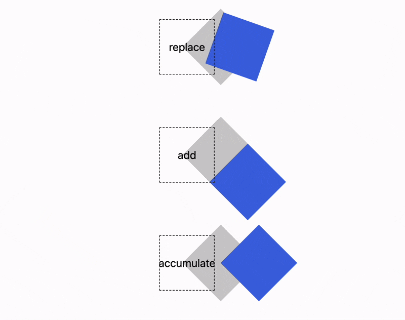
主要是这 3 个关键词:
- replace:覆盖(默认值)。动画会覆盖原有属性。
- add:追加。动画追加到原有属性后面。
- accumulate:累加。动画会和原有属性相同的部分进行累加。
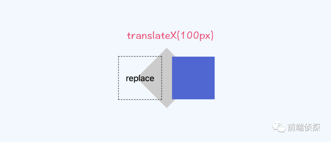
假设有一个元素,默认有一些样式
div{
  transform-origin: 50% 50%;
 transform: translateX(50px) rotate(45deg);
}
然后,给一个动画,关键帧是这样的
@keyframes adjust {
  to {
    transform: translateX(100px);
  }
}
下面是 3 个关键词的效果对比
第一个replace,也就是默认效果。其实就是直接将transform中的translateX(50px) rotate(45deg)变成了translateX(100px)。
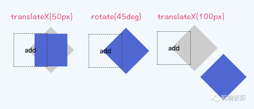
第二个add。可以理解成直接在transform后追加,也就是最后变成了translateX(50px) rotate(45deg) translateX(100px),等同于先向右移动50px,然后旋转45deg,再向右移动100px。下面是拆解过程(注意旋转轴)
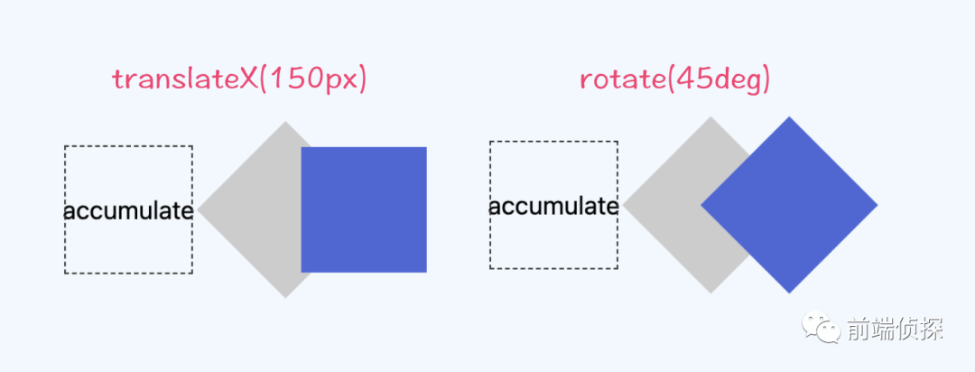
第三个accumulate。可以理解成将已有的translateX(50px)累加,最后结果是translateX(150px) rotate(45deg)
再来个比较火的抛物线例子:
最后的总结:
可以用一杯水来做比方
- replace:替换。将这杯水倒掉,然后倒进一杯油
- add:追加(叠加)。在这杯水上倒入一些油,油覆盖在了水上
- accumulate:累加(混合)。在这杯水倒入奶茶,里面都有水,混合在了一起